
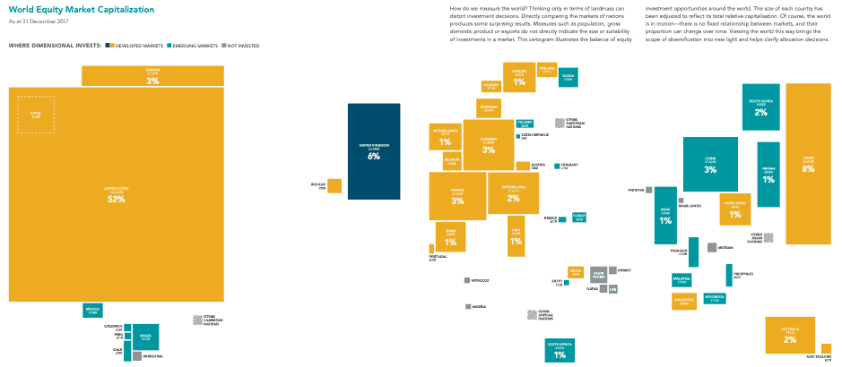
This is a world map distorted to show the value of each country’s stock market. It does not represent the size of each country’s economy – economies and stock markets are distinctly different things.
The first thing to notice is how big America is – at December 2017 the value of all companies listed on the US stock markets was 52% of the world’s total, and then see how small China’s stock market is – a mere 4% (counting China and Hong Kong). Although these two are the largest economies in the world, their stock markets are starkly different in size.
Interestingly the 3% mainland China is only accessible to Chinese citizens, with the 1% market cap in Hong Kong being the route for us westerners to invest in China.
And see the little square top left of America? That’s the value of Apple, and it’s not much smaller than the entire Chinese stock market. In next year’s edition I expect that square to be a bit bigger and be Amazon instead.
Lots of clients ask us about investing in China and India. We invariably talk them through this map and they are enlightened. As China’s and India’s middle class grows and they want to show off their wealth, they buy, for example, Apple iPhones, Mercedes cars and wear Nike trainers, all of which creates profits outside of China that are reported on the western world’s stock markets. There are of course some huge Chinese companies like Alibaba and Tencent, but in the grand scheme of things, their stock markets aren’t that big.
Which all makes for a confusing picture. If you think the economies of the Far East are going to expand rapidly, how do you invest in that? Which stock market are the companies that are going to benefit from this expansion listed on? America? India? Germany? Or somewhere else…?
The UK is another curious example. We represent around 3% of global GDP but 6% of the world’s stock market value. A lot of companies list in London to benefit from the language, time zone and the British legal and tax systems, they are not necessarily British companies serving the British public – think of Lonmin or Anglo American, both of which predominantly mine in southern Africa.
The FTSE100 is very different than the UK economy with around 75% of the FTSE100’s earnings being from overseas. It’s all a really complicated picture, isn’t it!
Our first default is to advocate investing globally – why would you want to miss out on the potential growth of 94% of the world’s stock markets? Thereafter it gets a bit more subtle and if you want to know more, please get in touch. As a geographer I love maps and this is one of my favourites, so I do like chatting about it.